
 As a group, we all had the same opinion on the titling for THE CABIN IN THE WOODS. I think the font stands out effectively and catches your attention without being too showy. The misty, grey background gives a spooky, nightmare effect which also makes the titles more negative and scary, which is something we are hoping to use for our opening. This type of font could be beneficial as it certainly draws the audience’s attention to it, the use of scratching over the letter gives the typography a huge mysterious and haunting effect which is something we, as a group want to achieve when creating our opening titles.
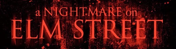
The use of colour is very effective with this title as it connotes hell, death, blood, nightmares and fury. Despite it being scary, we didn't think that red was a colour we wanted to adapt into our opening titles as it is quite an old skill that is rarely used anymore. We wanted our titles to match modern day horror's rather than past and even though red is used, we wanted our own horror opening to go down the route of using black and white to create a more haunting and eerie mood rather than a deadly or hell-like effect.
The fonts we found that matched the opening titles most were both:


Both fonts create an eerie and ominous effect, which is a theme we aim to capture when creating our opening titles. Despite both fonts being quite similar to each other, as a group we are all in agreement that Felix Titling is the font we are most likely going to use for our opening, as the thinner typography gives a more daunting and unnerving effect. We are hoping to create a title most similar to THE CONJURING as the white writing on a black background is a style we wish to match more than the others.
The fonts we found that matched the opening titles most were both:
Both fonts create an eerie and ominous effect, which is a theme we aim to capture when creating our opening titles. Despite both fonts being quite similar to each other, as a group we are all in agreement that Felix Titling is the font we are most likely going to use for our opening, as the thinner typography gives a more daunting and unnerving effect. We are hoping to create a title most similar to THE CONJURING as the white writing on a black background is a style we wish to match more than the others.
No comments:
Post a Comment